Layout Wizard
XSplit Broadcaster’s Layout Wizard is designed to make the process of creating your XSplit presentations easier and faster with just a few clicks.
If it’s your first time using XSplit Broadcaster on your computer, click the Get started with a layout button in the welcome screen.
If the welcome screen is not visible, go to File > New Presentation to reset the XSPlit Broadcaster stage.
The Layout Wizard option will not be available if you set your XSplit Stage to portrait resolution.
There are six layouts to choose from, each suitable for a specific use-case.
Keep in mind that this feature is designed only to simplify the initial layout design of your XSplit Broadcaster presentation. You can always manually change the layout and its properties directly from the XSplit Broadcaster stage when needed.
All Sources in the layouts include the option to Scale to fit to adjust the size of the source to fit the source area. This is unchecked by default, but feel free to check this if necessary.
Solo is for those who would like to just add one full screen source in their presentations. Great for showing videos, screen/game capture sources in full screen where no other sources are needed.
Use Full Split Screen if you want to fill the entire screen with two different sources side-by-side. Ideal for when adding two sources with portrait orientation. In this example we’re showing images of two individuals, perhaps as a scene for introducing guests/hosts of a show.
This layout is slightly similar to Full Split Screen, but with the two side-by-side sources presented in landscape orientation. A Preset Background or custom image can be added under your split screen sources.
In this example we’ve added two webcams as the camera sources, and a preset background.
The 4-way Split screen layout displays 4 evenly-spaced sources at once. This is a great layout to use when adding participants from your video conferencing programs.
This layout strategically places your sources such that the smaller source is meant for webcams, and the bigger one for your presentation source–an ideal setup for live presentations/tutorials/demos. You can also add a background if you wish.
Very similar to the Solo Presentation layout, but with an additional source suited for webcams placed at the opposite end.
Accessing the Layout Wizard
If it’s your first time using XSplit Broadcaster on your computer, click the Get started with a layout button in the welcome screen.
If the welcome screen is not visible, go to File > New Presentation to reset the XSPlit Broadcaster stage.
The Layout Wizard option will not be available if you set your XSplit Stage to portrait resolution.
The Layout Wizard Menu
There are six layouts to choose from, each suitable for a specific use-case.
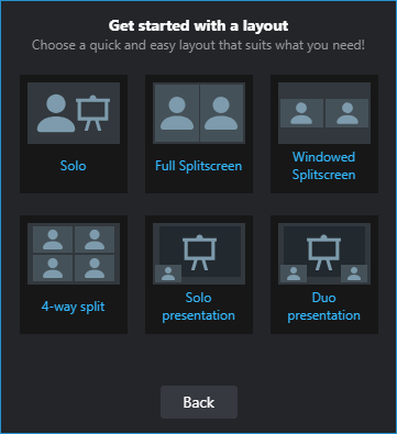
Keep in mind that this feature is designed only to simplify the initial layout design of your XSplit Broadcaster presentation. You can always manually change the layout and its properties directly from the XSplit Broadcaster stage when needed.
All Sources in the layouts include the option to Scale to fit to adjust the size of the source to fit the source area. This is unchecked by default, but feel free to check this if necessary.
Solo
Solo is for those who would like to just add one full screen source in their presentations. Great for showing videos, screen/game capture sources in full screen where no other sources are needed.
Full Split Screen
Use Full Split Screen if you want to fill the entire screen with two different sources side-by-side. Ideal for when adding two sources with portrait orientation. In this example we’re showing images of two individuals, perhaps as a scene for introducing guests/hosts of a show.
Windowed Split Screen
This layout is slightly similar to Full Split Screen, but with the two side-by-side sources presented in landscape orientation. A Preset Background or custom image can be added under your split screen sources.
In this example we’ve added two webcams as the camera sources, and a preset background.
4-way Split
The 4-way Split screen layout displays 4 evenly-spaced sources at once. This is a great layout to use when adding participants from your video conferencing programs.
Solo Presentation
This layout strategically places your sources such that the smaller source is meant for webcams, and the bigger one for your presentation source–an ideal setup for live presentations/tutorials/demos. You can also add a background if you wish.
Duo Presentation
Very similar to the Solo Presentation layout, but with an additional source suited for webcams placed at the opposite end.
Updated on: 11/08/2022
Thank you!